You're not losing orders because of your menu prices.
You're not losing them because of your paid ads.
You're losing them because your website makes it too hard to order.
It's not a marketing problem. It's a friction problem.
Orderbase is a headless eCommerce platform built by Mitch Designs in Cairo. It runs your website, mobile app, orders, stock and branches from one system.
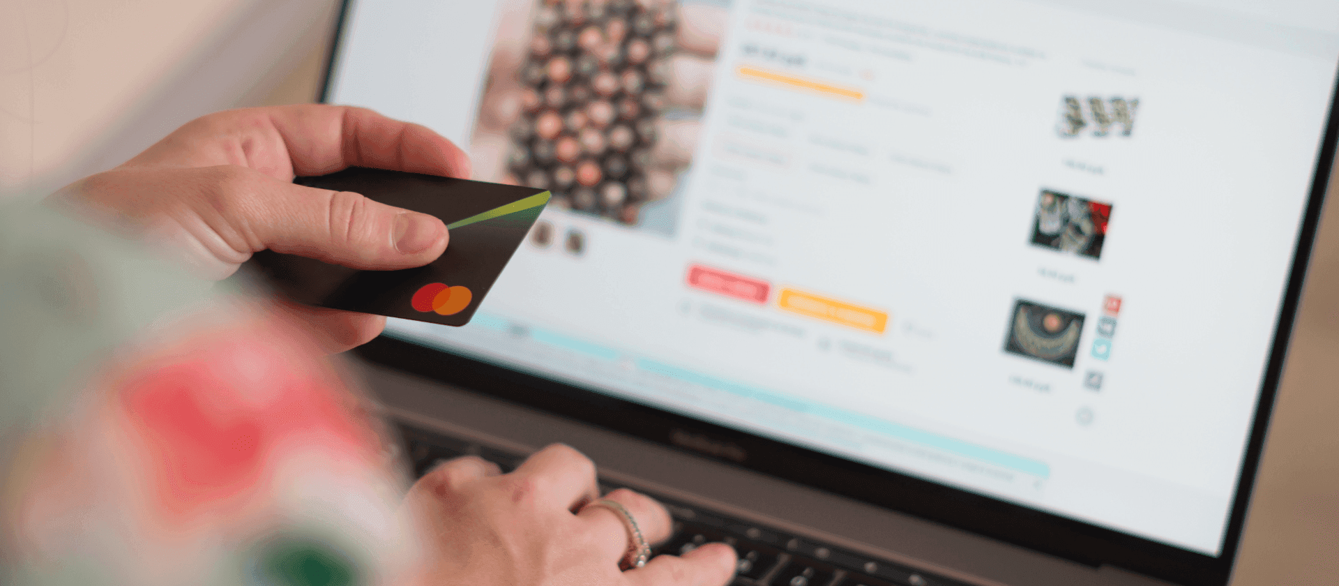
If mobile checkout takes more than three taps for a customer ordering dinner, you're handing that order to the restaurant next door. And you probably don't even know it's happening.
Why Does Mobile Checkout Lose Sales?
Mobile checkout loses sales because every extra tap, form field and slow page gives a hungry customer a reason to quit. They rarely complain. They close the tab and order from someone else. You never see the lost order, only the quiet drop in sales.
Most food and retail websites in Egypt are built for desktop, then later "adapted" for mobile. But mobile is where the real action happens. People order in traffic, on a lunch break and while scrolling in bed.
Your mobile site isn't another version of your desktop site. It's the only version most customers will ever see.
Why does every tap count?
Every tap is a tiny decision. Tap. Wait. Decide. Tap again. Think. Wait again. Every tap is a chance to hesitate, and hesitation is the enemy of conversion.
What feels normal to you feels exhausting to a customer ordering dinner on the way home.
- Long forms
- Unclear buttons
- Slow pages
- Drop-down menus that don't work well on a phone
You don't get feedback when customers quit. They just leave.
Why Do Most eCommerce Platforms Fail at Mobile Checkout?
Most platforms fail at mobile checkout because they were built for desktop and patched later with apps, plug-ins and workarounds. They get you started, but they slow down exactly when the lunch rush hits.
Many owners pick ecommerce platforms that were never designed for serious traffic or fast mobile checkouts. They look nice on paper. In practice, your checkout becomes an obstacle course.
How is Orderbase different?
Orderbase was built to remove friction and shorten the path to purchase, especially on mobile. Here is what sets it apart.
- Pages load fast
- Buttons sit where thumbs expect them
- Menu options are easy to select
- Checkout takes just a few taps
- Cards saved in the mobile app give one tap reorder
No confusion. No distractions. Just a straight line from menu to payment. The Orderbase headless eCommerce platform guide explains how it works.
What Should a Mobile Checkout Look Like?
A good mobile checkout lets a customer order in three taps or fewer. Pick the dish, choose the size, pay with a saved card. Anything beyond that is friction that costs you the sale.
On a typical website, ordering dinner goes like this.
- They open the menu item
- They hunt for the size or add-on options
- They close a pop-up and pick a portion
- They scroll to find the Add to Cart button
- They tap it, then tap the cart icon
- They fill out 6 or 7 checkout fields
- They enter card details, hit confirm, and finally place the order
Somewhere in the middle, many people drop off.
Now the same customer on Orderbase.
- They land on the dish
- They choose the size
- They tap "Order Now" with their saved card
Done. It works even better for repeat orders. A customer who ordered last Friday taps once and pays, with no retyping.
It's not magic. It's just good design.
Should You Blame Your Paid Ads?
No. Fix the checkout first. You don't need more reach if your website can't convert, and you don't need more followers if your checkout scares them away.
The best UX isn't flashy. It's invisible. The customer barely notices what they're doing because the flow feels that natural.
When your store loses people who are ready to eat, the problem is no longer your marketing. It's your platform. Orderbase turns your website into a real sales channel, because it's not about having more features. It's about having less friction.
FAQs
Why do customers abandon mobile checkout?
Customers abandon mobile checkout because of friction. Long forms, slow pages, unclear buttons and too many taps all make ordering feel like work. On a phone, patience is short. A hungry customer who hits an obstacle will simply close the tab and order from another food brand instead.
How many taps should a mobile checkout take?
A mobile checkout should take three taps or fewer. The customer picks the item, confirms the order and pays with a saved payment method. Each extra tap, form field or page load is another chance to hesitate, and hesitation is where sales are lost, especially for repeat orders.
Do saved cards help repeat orders?
Yes. Saved cards let a returning customer reorder in one tap without retyping details. Orderbase supports cards saved in the mobile app for one tap reorder, which suits food brands where the same customers order the same meals again and again.
Should I spend more on paid ads if my orders are low?
Not before you fix checkout. More traffic into a broken funnel only wastes budget. If visitors are ready to order but leave at checkout, the problem is the platform, not your marketing. Remove friction first, then invest in growth.
Ready to See What a Frictionless Website Feels Like?
Build a store that moves with your customer, not against them. Talk to Mitch Designs about Orderbase, the headless eCommerce platform for food brands, and book a free consultation.